
Candidate Number: 379396
Research
When looking at more contemporary examples of album covers, one thing immediately becomes apparent to me. The band and album name are usually not seen as a focal point of the cover, rather they accompany the design or even hide away in a corner and let the design do the talking. This indicates that album covers of more recent times embody the music they represent in design, colour, and theme to the extent that other information is seen as secondary. To accomplish this, abstract ideas and designs were incorporated into album covers to convey messages and ideas that words would struggle to. A great example of this is Radiohead’s A Moon Shaped Pool, which is a monochromatic yet entrancing artwork that shows a painting left to succumb to the elements, losing form and identity. This is a very powerful example of how modern album covers convey messages through abstract means.
Over the course of most of musical history, album cover designs have been more straightforward and formal, showing the artists more often and making the information you’d see on an album cover easily read and recognisable. You could argue this is due to the physical nature of purchases of the time, meaning that people probably wouldn’t buy an album if you didn’t know who made it or what it was called. An iconic example of this is Frank Sinatra’s Come Fly With Me. It features one big focal point, which is Frank Sinatra himself. Come Fly With Me is written on his left in contrasting colours elegantly. The background is vibrant and simplistic, which compliments the colours and puts the audience’s focus on Frank and the title. As you can see, this is very different from modern albums as not a lot of meaning is presented. However, this was ideal for consumers as they wanted to know they were buying a new album from Frank Sinatra, and therefore he was a large part of the albums identity as a whole.
Another interesting example of some of the first album cover designs is the prominence of minimalism and psychedelic among early album covers in the 60’s. These two design choices can seem to be very contrasting but show a distinct shift in album cover design to feature more meaningful and complimenting cover designs. This can be seen in The Beatles – Sgt. Pepper’s Lonely Hearts Club Band and The Velvet Underground – The Velvet Underground & Nico. The first cover features a complex and colourful design, with different forms of media, such as painting, sculpting, photography, and floristry all beautifully collaged together to create this colourful and positive album cover. The other album cover, The Velvet Underground & Nico, is a minimalistic cover, designed by Andy Warhol. The pain appeal of the album is the minimalistic and abstract design that has been chosen, however it is still meaningful. The banana pictured on the cover is a sticker ad can be peeled back to reveal the flesh behind the skin. This is relevant as the band at the time were seen as peeling back layers in their genre and being very experimental. This is a good example as it shows how other external things such as stickers can be added to album covers to make them more meaningful, artistic, and memorable. This cover was made by Andy Warhol and was painted onto canvas and then photographed.
An iconic part of album covers over the years has been the fonts used. They can be associated with the identity of the band or album and help covey the themes presented in the album as a whole. An example of this is Metallica. Although not an indie band, it is the most famous example of an iconic font used by a band. The sharp and thunder-like angles along with the loud and bold lettering create a typeface that truly embodies the band itself. This font symbolises the fast and aggressive music that they make, shown through the sharp angles and elongated letters which almost ‘pop out’ at the viewer.
This research will impact my experimentation and project as I will take inspiration from different things I have looked into. I would like to experiment with the distortion shown in Radiohead's A Moon Shaped Pool and try to recreate the effects of the deteriorated paint in a photo editing software such as Photoshop as opposed to exposing it to the elements.
Another area I researched are Gestalt Principles. Understanding how the brain groups and tries to understand the world would allow me to get a deeper understanding of the psychology of branding and how I can use that for myself when designing my album cover and perhaps even a logo.
This means that we as humans tend to group together or separate things based on these principles. This also applies to colour and texture. This is particularly important for my project as I plan to utilise mixed media and a very purposeful colour scheme in my album cover. Gestalt principles can be seen everywhere and influence creatives to think more intently about how they show something to an audience, and how they can subvert these principles to give things layers of meaning to those with a trained eye.
However, for me, the most useful part of this research is the understanding of how people group and recognise things, due to the fact that I am producing a product. If I think carefully about the composition of my album cover, It increases my chances of the cover being noticed and understood.
Next, I looked more into colour theory. I investigated the connection between songs, colour, and emotion. I looked at many albums covers and noted the colours and genre of the album, and what they made me feel. It is known that music is associated with emotion, and emotion with colours, but then why do we associate music with colours?
I investigated studies using classical music that highlighted how people associated colours with songs. It showed that slower paced songs were seen with darker and bluer palettes. Grey is associated with calmness and melancholy, whereas brighter and more vibrant colours are associated with more active emotions such as happiness and anger. Therefore, it seems that the activity of emotions corresponds with the vibrancy of colours, especially ones like red and yellow. I think this is because red and yellow are associated with daytime, a warmer and happier time of day as opposed to the colder and more lonesome blue and black night sky. This translates to music as the tones and rhythm chosen in compositions
When looking at an album such as Metallica’s Master of Puppets, using colour theory can decide what the album in question would sound like.
The use of reds, whites, and blacks together show a mix of emotions that blend and juxtapose each other to create a more complex narrative. The use of red and black in the background show a foundation of intense anger, the use of black indicates slower or more sinister themes. Therefore, you can infer that the base of this album has themes of rage and violence at a mix of intense speeds and slower melodies. The use of white and grey indicates composure and calmness at a fast pace. This could come from vocals or prolonged and timed rhythms that show a confident and unshakable reinforcement that compliments but is unique from the intense foundation of this sound. It’s obvious, without knowing anything about Metallica, that this is at least a rock album, and that’s without even observing the imagery itself and just utilising colour theory.
This will be useful to me in my work on an indie album cover as I can use different colours in different combinations to create a reaction and initial impression on observers and cater this response to appeal to my target audience to increase its artistic appeal and financial success.
In addition to this, you can see many of the gestalt principles in action in the album cover. Things like proximity and continuance in the form of patterns can be observed to direct the eyes of people who look at towards the band and album name, and also make the cover more cohesive as a whole.


I also looked into mixed media as a part of my research. This is due to the fact that I wanted to do something that was more unorthodox and more creatively appealing to me other than 2 different digital designs, as that limits my ambition and creativity. Therefore, I looked at other successful mixed media album covers, and Meek Mill's DC4 mixtape cover art really popped out at me while I was searching. The messy yet thoughtful look of it perfectly compliments it as a mixtape, a compilation of songs use to 'show off' your prowess as an artist, and usually produced before you even think of an album. This "We'll make do" sort of thinking where you try to try and use

what you have to create something that can change your life, even if it isnt as pretty or as neat as other people's is something that I think perfectly links to both Poet's Corner and their creative vision along with the gritty and hardworking undertones what I think perfectly describe this less appealing underbelly of British culture that Poet's Corner aim to blossom from and which I aim to honour, and this cover art in particular. This really inspired me and made me decide that for at least one of my cover designs, I wanted to try and create something grander than its parts using mixed media.
The cover features an orange background that pops out at you and grabs your attention, surrounding a mugshot picture. This contrast of colours draws your attention to the person and the use of orange, white and black could have been chosen due to their connotations with the american prison system and the inmate uniforms. This further references the hardships involved in the artist's life. The base of the cover is a scanned photo of Meek Mill's criminal documents. These show his troubled past and the fact they are highlighted in orange, whilst he is kept in greyscale could show how his crimes are the first thing people see when they look at him. This is a perfect example of a gritty album cover, that highlights hardships and is of lower quality but is full of thoght and passion nonetheless. The use of writing and paper as a background and extra detail in a cover is very appealing to me, and gives a lot of options to show depth and different colours, along with exploring different materials.
The next album cover I researched was Slanted and Enchanted by Pavement. The cover itself is an augmented (or defaced) version of Ferrante & Teicher's Keyboard Kapers, a 60's piano album featuring elegant and upbeat songs. On top of this, written in a very crude and rushed fashion, is the name of Pavement's album. The style of the cover is a modern, abstract illustration, much like graffiti. The act of painting or defacing buildings or art has been used for thousands of years as a way to mark your presence somewhere and show the world that you were here. It can also be an act of rebellion and shows
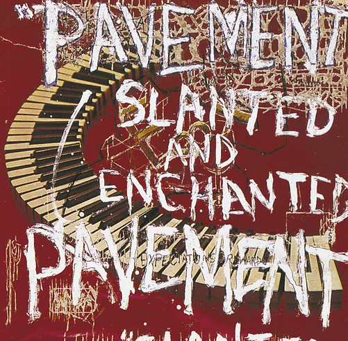
discontent. The significance of Pavement painting over this album cover could be seen as them painting over the reined past and creating a freer and more expressive future. The methods for creating the cover are paint and etching / destruction, probably with a sharp object. This is very fascinating to me as the original cover has both been added to and subtracted from, giving a depth in the picture that was otherwise not there. Another detail pavement added was to subvert the standard text format, and have the words on the right hand side, instead of the left. This again shows the rebellion and
As a part of my research, I made a mood board showing different art styles, media, and colours I wanted to use and what kind of messages I wanted to convey. I chose a mix of photography, mixed media and digital photo manipulation as these are things I wanted to learn about and explore creatively.


I have also added a spider diagram to clearly map out and show my initial creative ideas. This will help me during my research and experimentation as I can branch out and learn about new techniques and cover designs.