
Candidate Number: 379396
Final Product
For my final product, I decided to create 2 different designs using different techniques and colours to make a wider set of products for the band and also help me better demonstrate my techniques whilst not crowding the cover too much.
Album Cover 1
My first design started off with me creating a 3D paper rendition of some of the photos I took of flats in my local area. This wasn't too complicated, but having to create the different ledges and corners in the building helped me create depth which will make a more interesting cover later on. I made this paper building as I wanted to try and replicate the photograph and lighting from when I took the original photo, but using this new and interesting replacement for the building. For the paper,
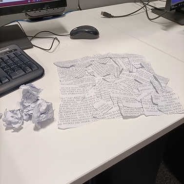
I took one of Lord Tennyson's poems (in this case I used Ulysses) and pasted it into Microsoft Word. I edited the font size and spacing to make it more compact, but still readable. I also changed the font to something more refined (Castellar font). The reason I used this poem is that the band is named after an area of housing in Goole called Poet's Corner. The roads are named after poets, such as Tennyson, and therefore I thought it was an interesting yet relevant way I could tie the cover to the band and its identity more subtly.


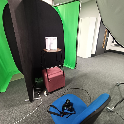
After I had made the paper building, I then used the studio in college to try and replicate the lighting and angles in the original photo. I set up the green screen in case I accidentally took a picture that had some of the background in it, and I positioned the light towards the top right to mimic the sun. I used a softer shade over the lamp to make the lighting not as harsh so it smooths any imperfections in my work and is easier to edit later on. I originally had the building on a small stool, but after checking the framing of the shot, I realised it would be much more accurate if it was higher so I was looking up at it, just like in the original shot. I therefore used an extra stool to prop up the paper building.
The lighting was still too harsh so I used some black walls to help absorb some of the light, like I did in portrait photography. I then set up the camera, setting the ISO lower as the light would drown out the rest of the photo when a photo was took otherwise. I increased the shutter speed slightly and focused my camera to help get a better shot using my knowledge of the exposure triangle. I crouched on the right side of the building, looking up at it and referenced my phone to make sure the photo looked just like what I was seeing in the viewfinder.
These photos show my process of configuring different technique, scenes, and angles. From the image you can see how I adapted to the flash and how I slowly replicated the angles and lighting I needed.


After this, I began making my first front cover for an album cover. I used Photoshop and Adobe Lightroom to achieve my results.

I think this front cover looks realistic and convincing due to my use of filters and colour grading in both Photoshop and Lightroom. The most convincing effect was the posterise effect, which i think tied both the windows and the paper building together and made them look more cohesive. I think this is due to the effect distorting and compressing some of the quality which bridges the gap between the higher quality close-up of the paper building and the lower quality far away shot of the flats. The use of different grading also blends the hazy orange paper and the jarring white windows.

I created the back cover using ripped up pieces of spare paper from the paper building, I carefully placed them into a square formation and took a picture with a smartphone camera, as I wasn't able to find a higher quality camera at the time. I then used Adobe photoshop to edit and stylise it to fir the aesthetics of the front cover, along with images of burnt paper I used to display the tracklist. I did this as any other form of displaying was either very abrupt and interrupted the theme of the whole album cover, or the text itself got lost in the very busy background of ripped paper.

Album Cover 2
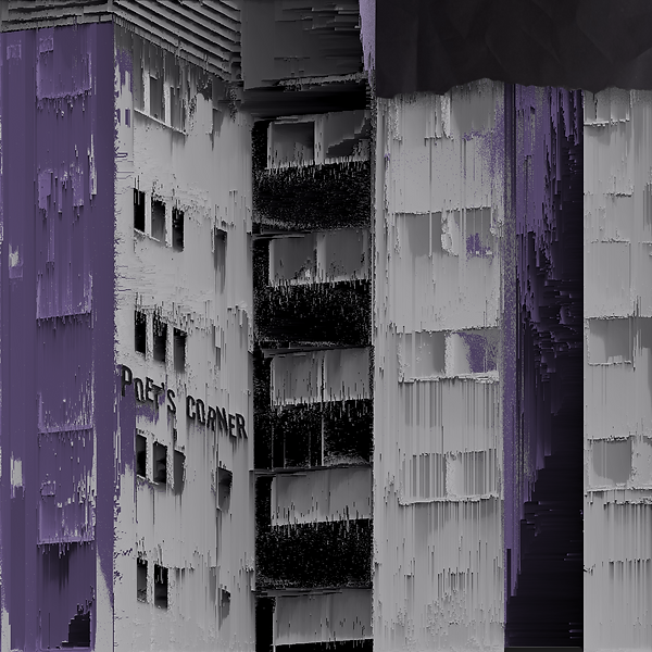
For my second album cover, I decided to utilise distortion techniques to create more texture and interesting shapes, using the photos of flats that I took during my experimentation process. I think that this cover, whilst not having as much depth as the other cover, is a refreshing and detailed album cover. I made sure to only use a few colours, such as white, black and purple to make sure it stands out and that no information get lost in different colours alongside the distortion. I also utilised perspective warp to splice different images together and make the transition more seamless. This can be seen with the band's logo, which I put on the wall and used the perspective warp to make it wrap with the building and then used a blend mode to make the rough bumps and discolouration of the wall behind it bleed through.

For this back cover, I took a lot of inspiration from my experimentation, especially the use of displacement maps and pixel sorting as a sort of adorning feature. For the displacement map, I decided to use a photo of the tree just under the building in the front cover, converting it to greyscale. I did this as I liked the idea of challenging myself with using minimal outside image other that those I have personally created. Another reason is using the theme of working class environments and the recycling of unwanted items was something I wanted to have influence my work. Even the sorted pixels are screenshots of edited photos of buildings I photographed, or even just the front cover itself as the colour scheme would be continuous. In the displacement map, I added the band's name, Poet's Corner, and added a very heavy noise filter to make it pop out when used as a displacement map. The piece of paper I used was sourced online, however I decided to use the solarise filter on it to invert the colours and give it a very interesting hue. I then added a grain effect to everything and added the track list on top of it. For the track list, I decided to follow the digital themes in the album cover and make the songs appear how they would on a command console, along with a suitable font to match this.


Here are the finished designs. I think they turned out well, and show a lot of different techniques. However, I would've liked to show a bit more of a creative vision and message behind my album covers, as I reference in my research and experimentation. I also added small yet useful side designs for the CD album covers, using muted colours and simply displaying the band name.