Experimentation
Before I even began creating anything, it was important that I knew what I wanted to create and what techniques I wanted to explore. Using tutorials, composition sketches, photography and typography, I was able to enhance my own skills and refine my ideas, using my research as a foundation.


Due to my focus on a more gritty, British narrative when making this album cover, it was important that I went out and got examples of the buildings I wanted to take inspiration and use in my work. The geometric styles, the folds in the walls that create depth, the calculated window placement, the patterns, I wanted to capture it all. Although, where I live there isn't too many opportunities for such photos. This limited my experimentation and inspiration, but I would try my best to get as much material as I could. This was useful as it both allowed me to play with composition of photos, and deciding how I want an album cover to be laid out, but also with finding material and inspirations.
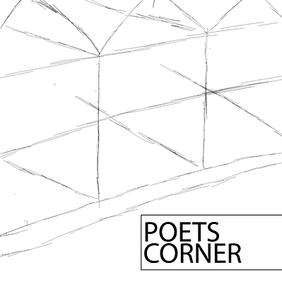
I then began doing different sketches of buildings, using different camera angles and compositions to have a variety in experimentation and to find what was most appealing. One thing I had to consider was the composition. This means that I needed enough space to fit the band and possibly album name on the cover, without this I would have possibly obstructed other parts of the album cover and therefore led to a unsatisfactory outcome for both me and the band.


These rough sketches show the band my creative vision, and saves me time as an outline shows my creative vison, without wasting time on a final product.
The next thing I did was edit and transform some of the pictures I took. The band wanted something unique and grunge, therefore I experimented with different textures and distortions to make a stylised image. Its important for this that I did many different revisions so I could get a picture that was still recognisable, but also distorted in some way. This is so the themes and messages behind the picture can still be understood.


I then looked at different font styles and referenced popular indie album covers for my redesign of the Poet's Corner logo.

I noticed that different bands have different styles and themes based on the names and styles of music. I focused on Mumford & Sons and Kings of Leon. These are very sophisticated and regal names, due to the words kings and the phrase '& Sons', which is commonly seen on businesses and has connotations of success and family.
This is a theme I wanted to emulate and build on with my logo. Poet's Corner is a very creative name with themes of fantasy. Therefore, I have decided to do an intricate and fantasy - oriented font and moulded it to be more cohesive and compact, referencing Gestalt principles such as continuation and other indie logos, such as Kings of Leon.


For my second one, I referenced the gritty, British nature by using text that looks like its been battered by wear and tear, or quickly stamped onto a surface like graffiti. This references the almost hooligan nature of British indie bands and the themes I have been researching and experimenting throughout the project. Overall, I'm more leaning towards the second, rougher design as it is more relevant to the band and its ideas, however the first style is very aesthetically pleasing to me and is more complex.

Inspired by my research on mixed media and text in art, I used Photoshop to distort text using a displacement map and a black and white filter. For the text, I used Lord Tennyson's poem, Ulysses. I removed the spaces in the text and changed the font to make it look more compact, stylised and refined. I used a picture of the building I took beforehand, and made it the map that my distortion would be based off of. This gave the effect that the text was wrapped and distorted by the building and gave the text a 3D feel. This distortion map also changed the brightness of the text and further added to the effect. I then removed some of the text in the bottom right, and added 'Poet's Corner' in a different font. I used the hue/saturation filter after I masked that specific bit of text to make it orange through the changing of the hue. I used a faint brush to add the glowing effect to bring more attention to the band name.

I experimented with what my album cover would look like on a CD cover. I got a CD template online and put my album cover design over it. I then created a spine design and a back cover using the same colour schemes and creative theme. This helped me create a cohesive cover that had a variety of different techniques, but didn't seem too crowded. A key part of this was using a PNG scan of paper and masking tape to put the text on for the back cover. I think that this was the best way to display text as anything else would interfere with the colour schemes and could possibly get lost in the background. By using something to jarring yet natural, such as paper, it gives the cover an authentic feel and further pushes the 'make do with what you have' mentality that I have explored in my research. I also created a border on the sides using distortion. I achieved this using the colours black, white, orange and grey and distorted them using a pixel distorter.
